A lot of fashion posters you see nowadays are bright, flamboyant, and oversaturated; yet if you rewind the clock a few decades, you’ll find that things were much different.
If you look at fashion magazine covers and images taken in the 30’s, 40’s and 50’s, you’ll notice that they were far more stylistic, minimalistic, and ultimately a lot more classy when compared to a lot of today’s fashion imagery.
It’s also a period in which some of the most iconic and well-known imagery was taken (think Audrey Hepburn in Breakfast at Tiffany’s), which decades later, still looks as stunning as it did on the day it was shot.
So, we thought we’d hunt down some beautiful examples of these images and illustrations that would make beautiful posters around your home.
Here they are. Enjoy.
#1 – Audrey Hepburn (Breakfast at Tiffany’s)
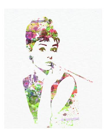
Breakfast at Tiffany’s was originally released in 1961, and went on to be one of the most iconic and successful films of all-time, due in part to Audrey Hepburn’s genial portrayal of Holly Golightly, a somewhat eccentric yet naïve girl.
There’s a lot of Audrey Hepburn/Breakfast at Tiffany’s posters and prints out there, but if you’re looking for something minimalistic and colourful, this is almost certainly the poster for you.
It features an iconic shot of Audrey Hepburn in her Breakfast at Tiffany’s role, yet it’s been transformed into a beautifully colourful image, and set on a simple white background.
It’s simple and eye-catching; making is a great poster for around the home.
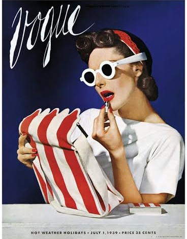
#2 – Vogue (July 1939)

Vogue is one of the most iconic and well-known fashion magazines out there, and as far as front covers for the magazine go, this is probably one of the most widely recognised and iconic covers ever.
It was first published in July 1939 (over 70 years ago), and features the fashion model, Muriel Maxwell.
In the image, the model appears carefree as she applies red lipstick with the aid of the mirror in her purse.
It’s an impactful cover, with an absolutely beautiful colour scheme and a subtle elegance that you rarely see on modern day magazine covers.
#3 – Marilyn Monroe (Chanel No.5 – 1955)
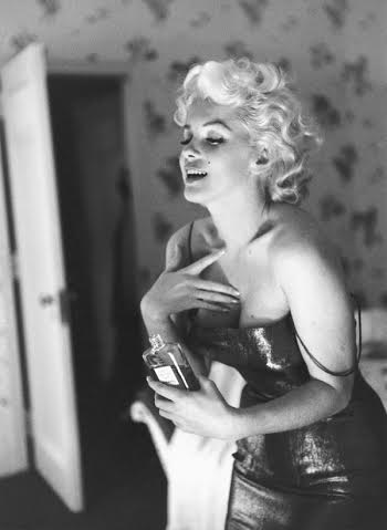
Perceived by many as one of the most beautiful, elegant, intelligent and fashionable women ever to have lived, this stunning image of Marilyn Monroe certainly embodies that perception beautifully.
It’s a simple image, printed in black and white, which was originally shot on behalf on Chanel No.5; a product that Monroe is now famous for helping to advertise, and a product that remains one of the most iconic perfumes of all-time.
Monroe appears as beautiful and elegant as ever in this image, and it looks great as a large print poster.
#4 – Bally
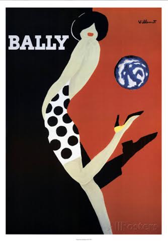
Bally commissioned this piece for an advertising campaign over 50 years ago, which was illustrated by graphic designer, Bernard Villemot.
Bernard Villemot might not be a big name these days, but in the 1950’s, he was at the height of his career, hence the reason Bally chose him for this project.
Bally has been associated with luxury for more than 150 years, and the company has since made a name for itself in the luxury accessories industry.
It’s a simple piece that makes fantastic use of colour and embodies everything the Bally brand stands for. It would stand out in just about any room, too.
#5 – Vogue (1950)
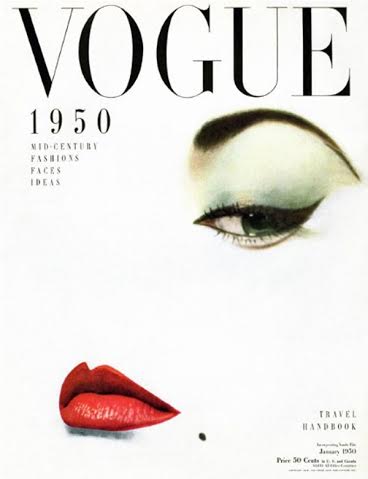
Over the years, Vogue has published a tonne of stunning magazine covers, but this one is certainly one of the most beautiful and iconic.
It was designed by Erwin Blumenfeld, published in January 1950, and coined “doe eye” by Blumenfeld.
It features the model, Jean Pratchett, although you might not guess from the image itself, as the photograph has been reduced to a bare minimum.
All you see of the original photograph is the eye, lips and a “beauty spot”, yet the cover still embodies the essence and beauty of the original photograph.
#6 – Audrey Hepburn (Breakfast at Tiffany’s 1961)
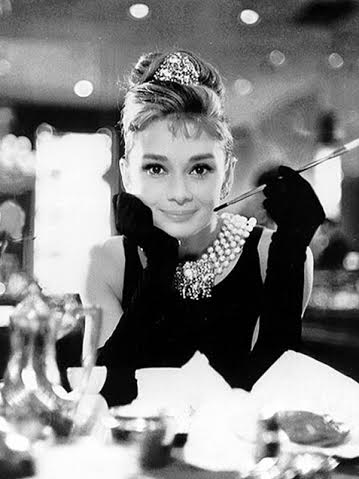
Here, we have another Audrey Hepburn fashion poster taken, once again, from the movie, Breakfast at Tiffany’s.
This is perhaps one of the most iconic photographs of Audrey Hepburn, and it’s easy to see why. It’s an image that embodies every ounce of Hepburn’s character in the movie, and it certainly makes a stunning poster.
If you’re looking for a constant reminder of Audrey Hepburn’s Hen Party (which featured many Hepburn lookalikes), then this is the poster for you. It’s black and white, and would look great in any room, especially a bedroom.
#7 – Italian Glamour
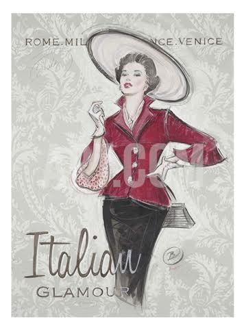
Italian Glamour is a great poster, which manages to capture the combination of chic beauty and style that the Italian fashion industry is perhaps most well known for.
It features nothing more than a woman, dressed in an elegant combination of a red jacket, black skirt, and large attention-grabbing hat. The illustration is sat on a beautiful repetitive pattern, which gives the printed poster a largely vintage feel.
It’s a beautiful illustration, which would work well as a centrepiece for just about any room. The red of the woman’s jacket really stands out.
#8 – Murellafix Fabrics (1951)
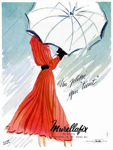
Murellafix Fabrics created this stunning design back in 1951, and today, it has an iconic vintage look.
It features a beautiful illustration of a woman in a bright red dress, covering her face with a simple, elegant white umbrella.
It’s a great piece that invokes a sense of mystery in the viewer, as the ladies identity, facial expression and general appearance is unknown. It also makes use of great colours, with the red standing out from the predominantly white/light background.
#9 – Legs & Stockings
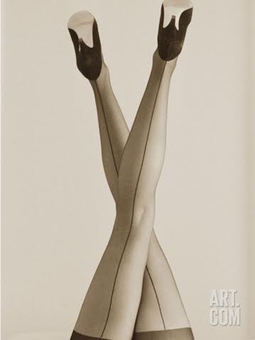
You don’t get many fashion posters that are much more simplistic than this, as it features nothing but a beautiful photo of a woman’s legs in stockings.
It’s a great image that has a certain sex appeal to it; it’s also a pretty dramatic piece that is likely to capture the attention of your guests, no matter where it’s placed.
The colour scheme of the image is another thing to note, as it’s more sepia than black and white, which really helps to give the piece a unique quality.
#10 – Vogue (Chanel Sequin Dress – 1936)
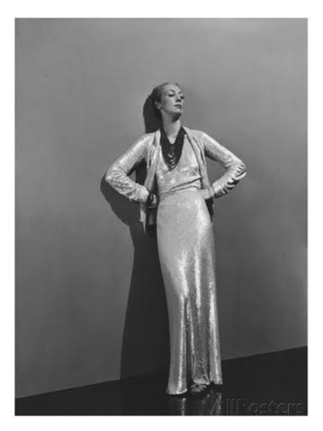
Vogue published this image almost 80 years ago, back in December 1936, yet it looks as stunning today as it did all those years ago.
It features an iconic photo of a well-dressed woman, with her hands on her hips, seemingly pondering life, whilst leaning on a wall.
It’s black and white, which gives the image a classy appearance. It would make a great addition to any wall.
Bio: chris is a designer based in the UK, who also has a love for vintage photography. He has a passion for fashion, and a particular fondness for Marilyn Monroe.

